The Augustine Institute needed to evolve and refine the brand of its digital faith formation platform called Formed. Formed’s brand needed to better align with the Catholic faith and to be ready for growth and future enhancements.
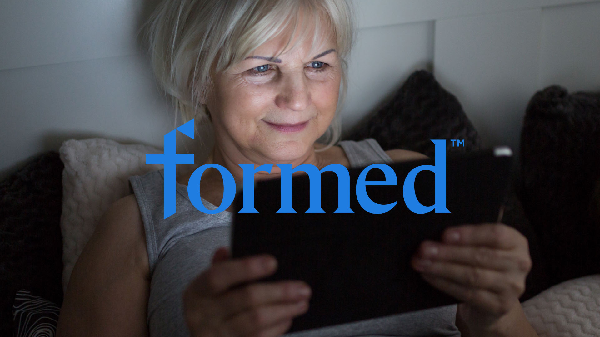
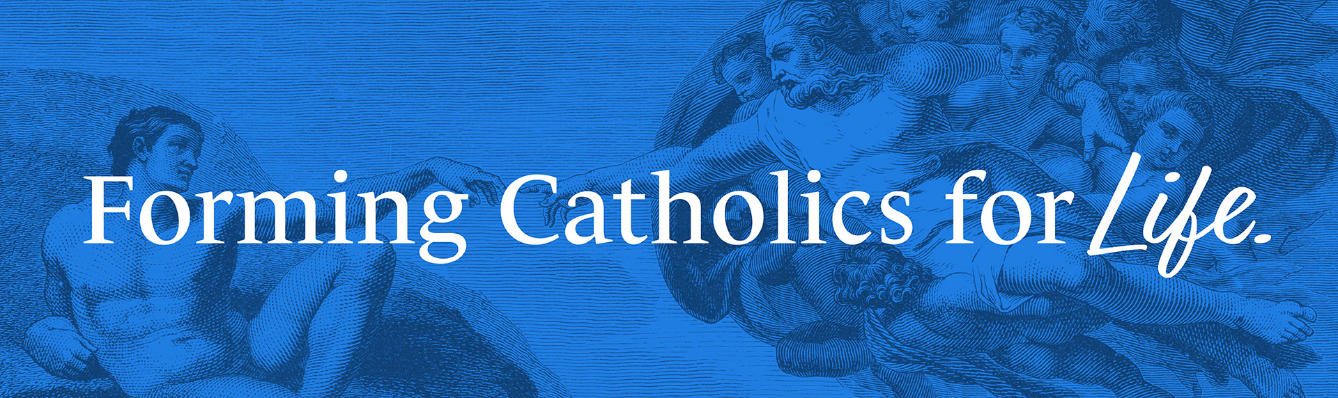
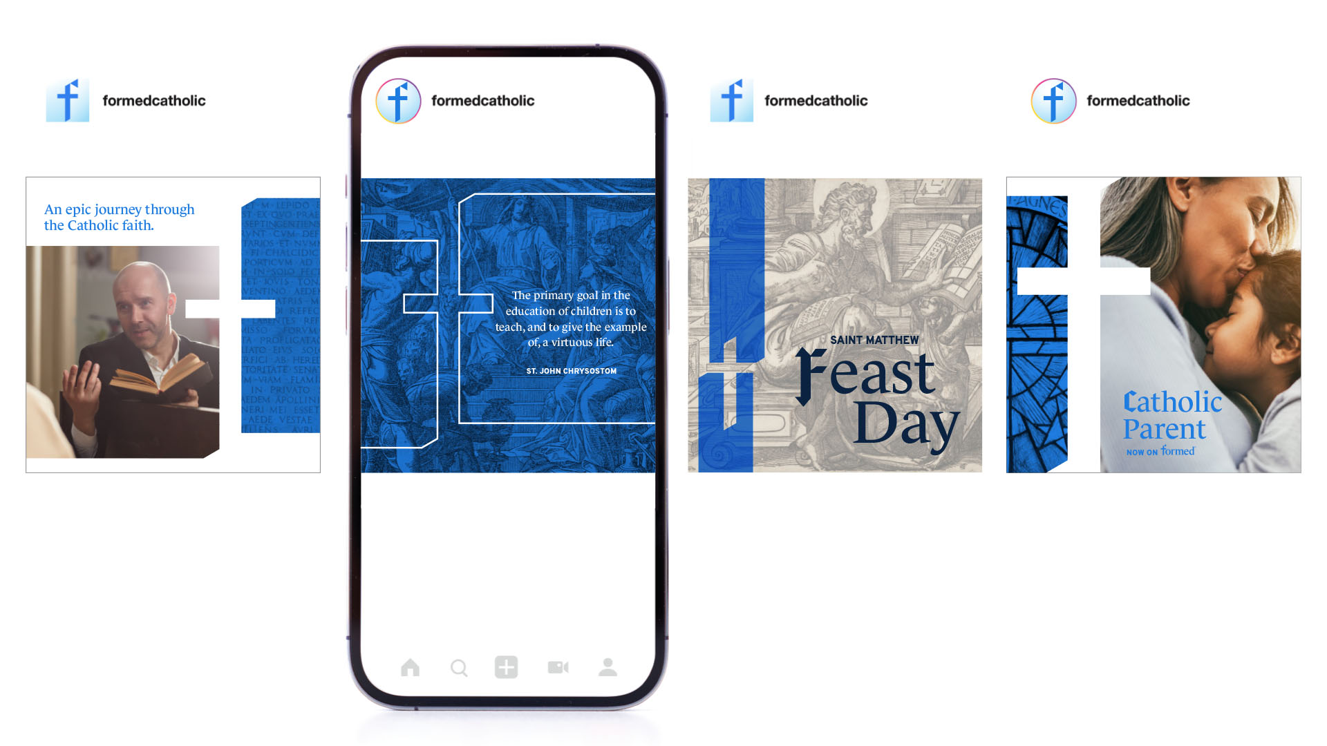
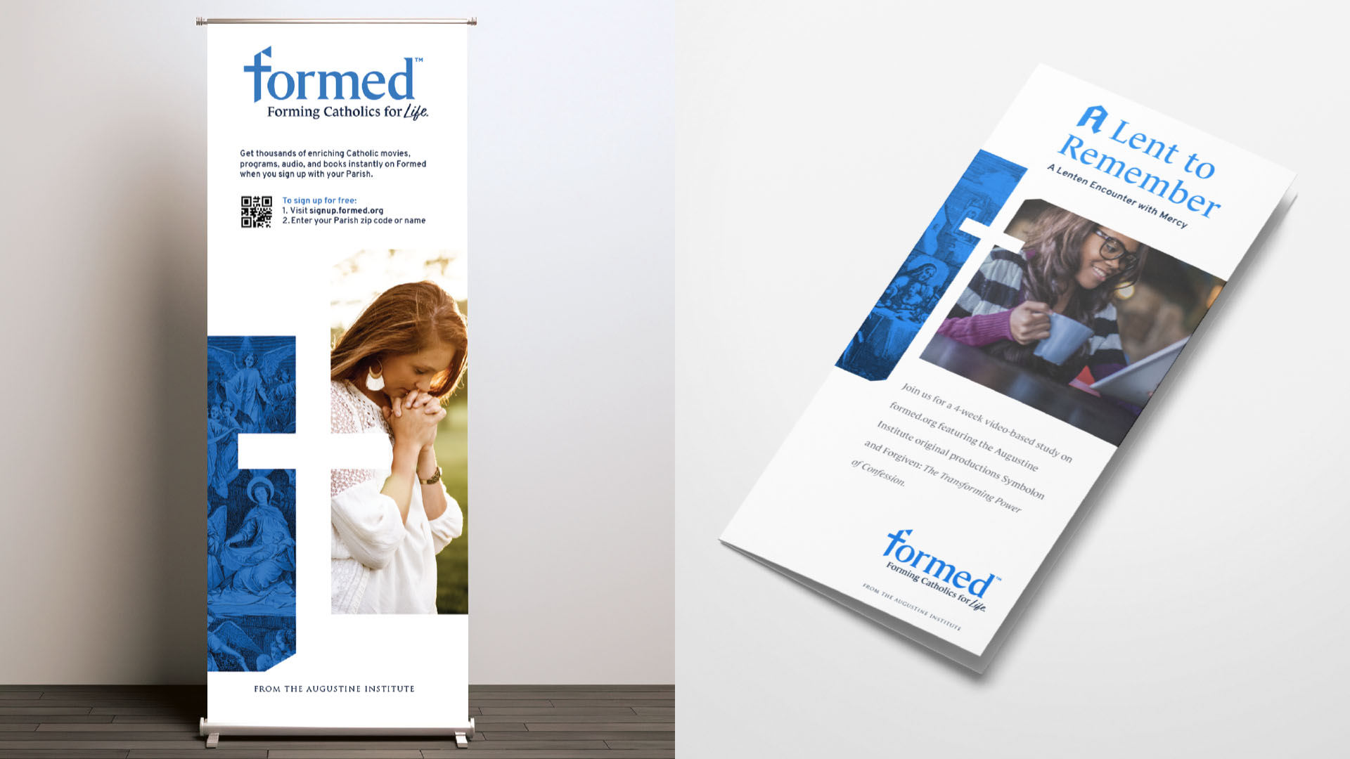
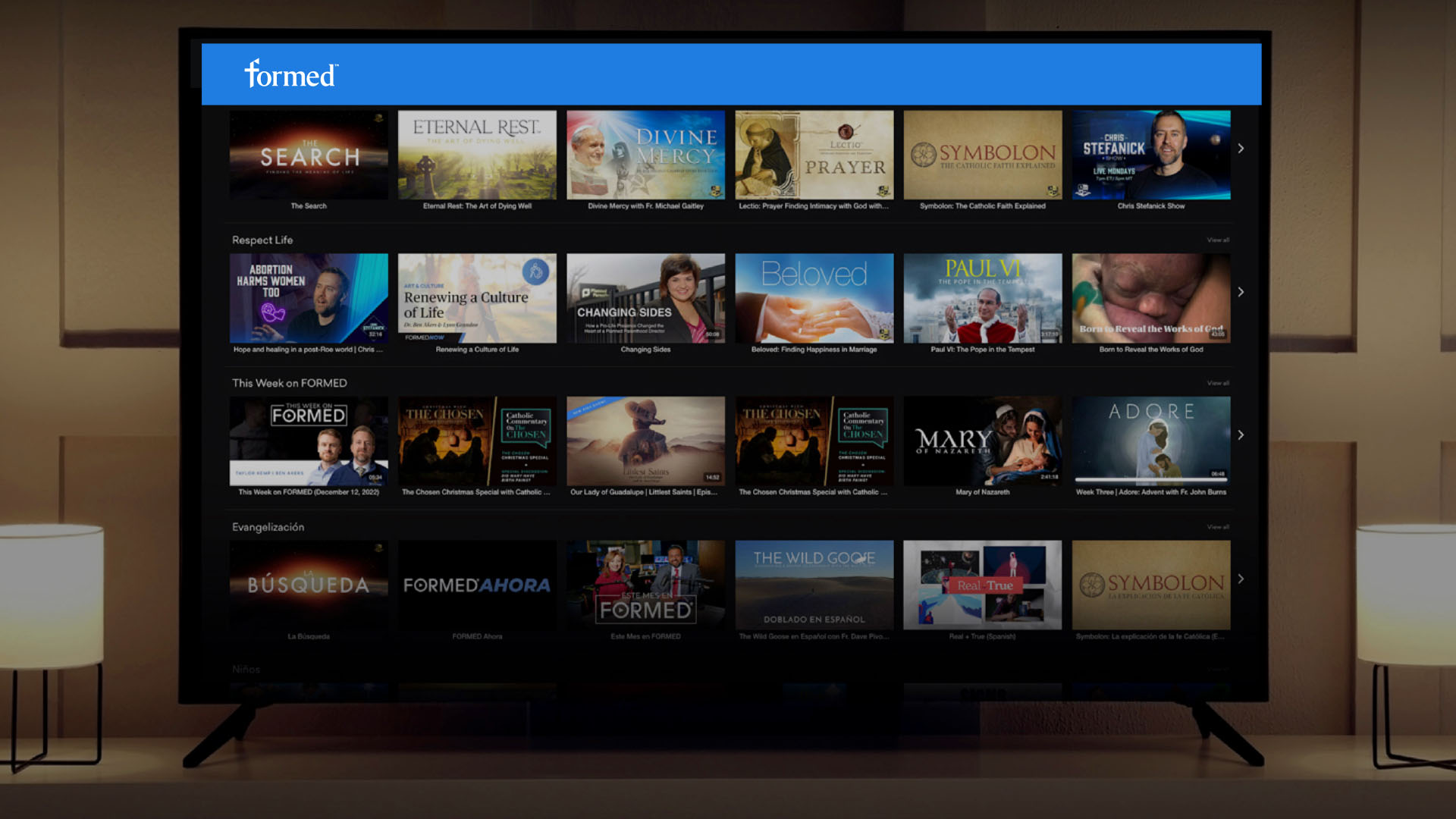
Formed provides Catholics worldwide with an expansive library of video, audio, and written resources designed to deepen faith and enrich daily life. After its original launch, the platform quickly grew beyond initial expectations, becoming a trusted destination for Catholic education and guided spiritual journey. As the organization evolved its positioning to “Forming Catholics for Life,” the visual identity needed to be updated to reflect this renewed mission while remaining connected to its history. Bluebird partnered with Formed to reimagine the brand identity through design, building on their strong foundation while aligning the look and feel with the broader Augustine Institute family of brands.
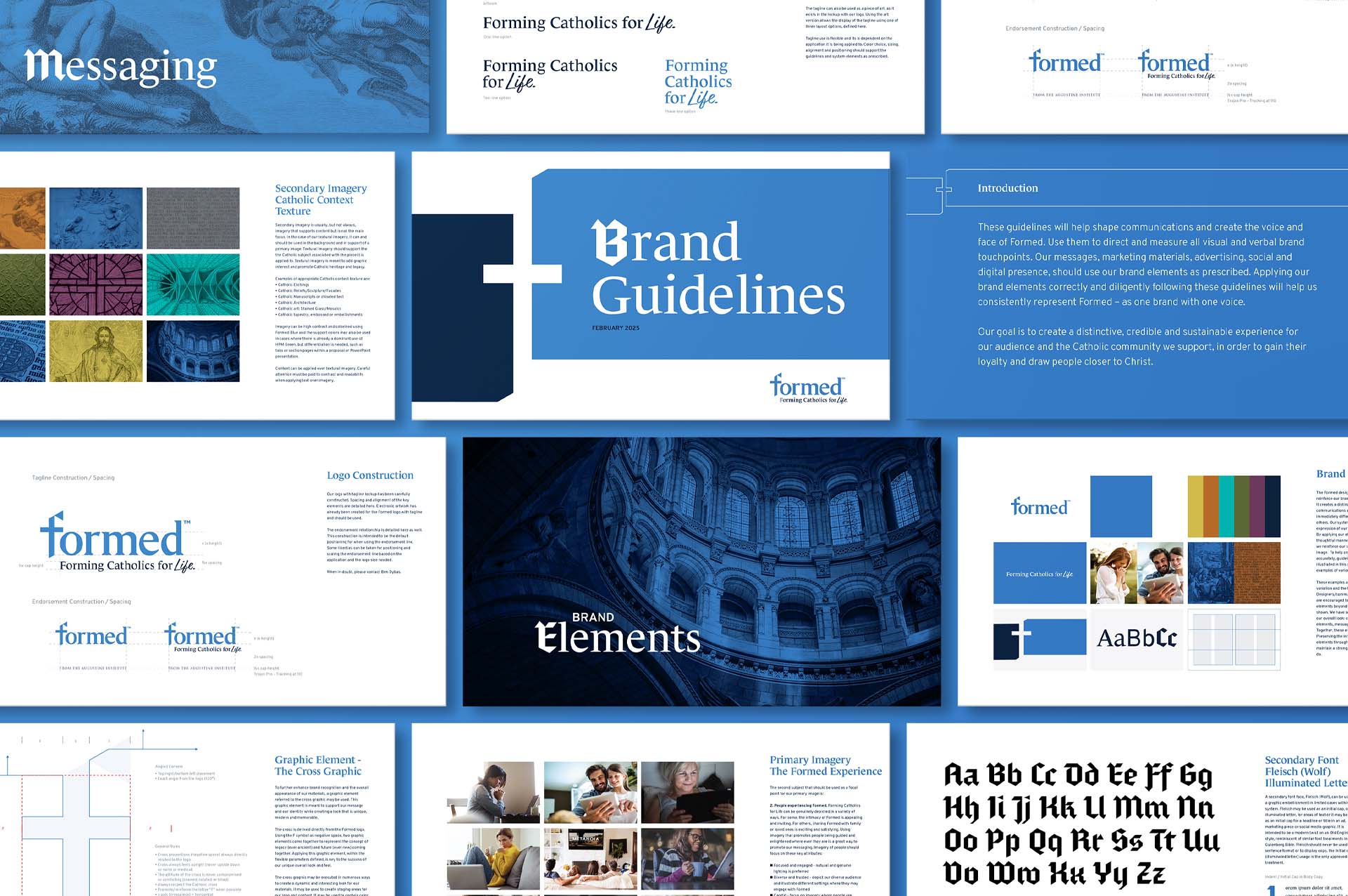
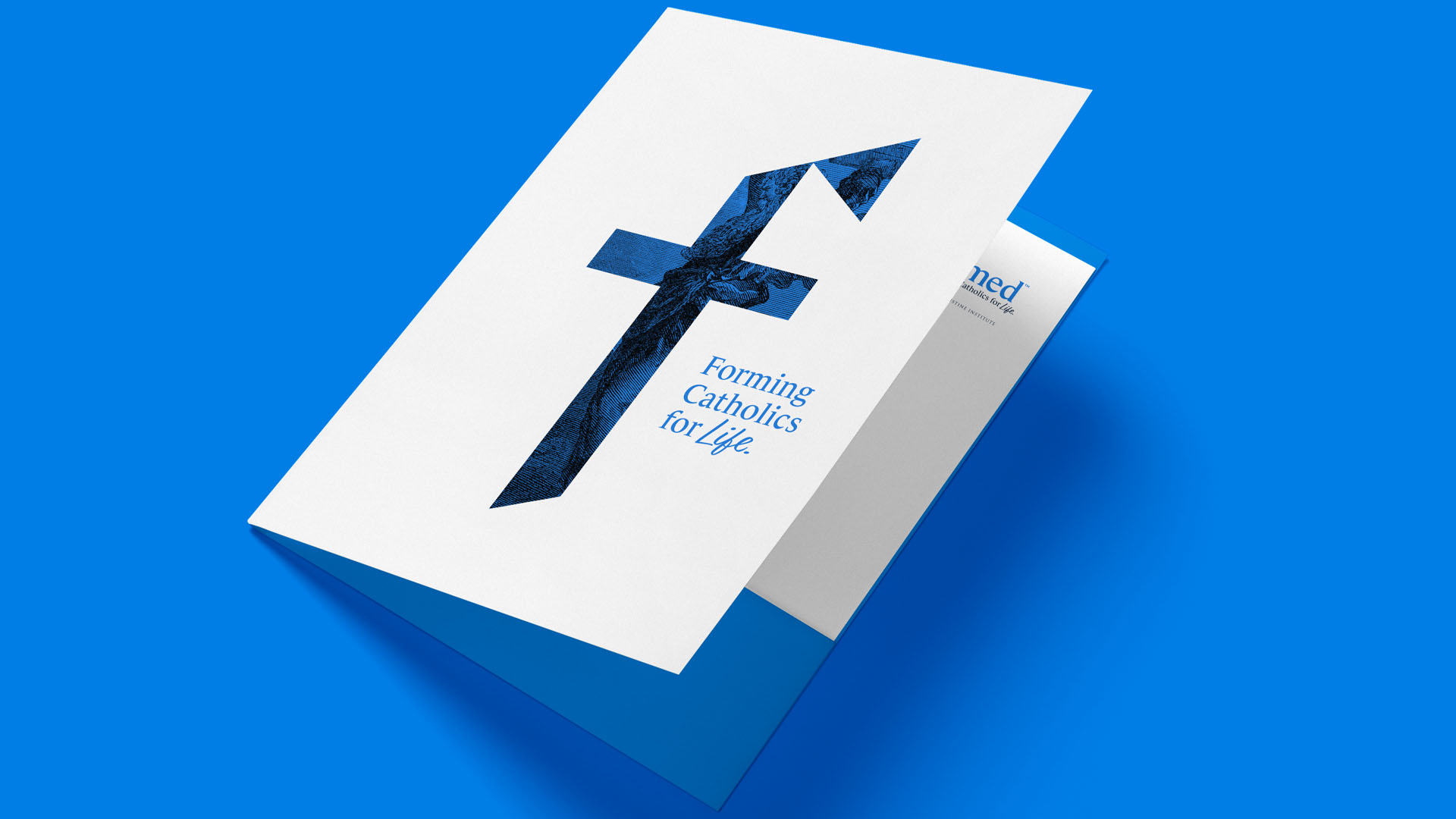
The new Formed wordmark does several things: It promotes an obvious alignment with the Catholic faith by integrating the cross. It pays homage to the legacy of the past mark and the simple “play button” by incorporating the arrow along with chiseled angular shapes, promoting forward movement and a sense of direction or “guidance.” It also tips its hat to the black letter, “Illuminated letter” that accompanies many bible productions. And it promotes the Marian Blue symbolizing purity, humility, and devotion.
CHALLENGE
Formed had already established strong brand recognition, so the challenge was not to reinvent but to refine. The visual identity needed to honor existing brand equity while clearly connecting to the Augustine Institute’s established system. At the same time, the logo had to communicate both the richness of Catholic faith and the modern accessibility of a digital media platform. Balancing tradition and innovation (ever ancient, ever new) required a thoughtful design approach, one that could bring forward familiar elements while integrating new, mission-driven cues.
DELIVERABLES
Logo Development
Visual Communication System
Brand Guidelines
THE RESULTS
The refreshed logo and visual communications system captures both continuity and progress. The inclusion of a cross purposefully grounds the identity in Catholic tradition, while the subtle nod to the “play button” conveys the accessibility and momentum of a streaming platform. By retaining key elements from the previous logo, the redesign preserved recognition among long-time users, while the new details signaled alignment with the Augustine Institute family and the brand’s evolving mission. The result is a modernized, meaningful identity that reflects Formed’s role in guiding Catholic life for generations to come.
“Lorem ipsum dolor sit amet, consectetur adipiscing elit. Nam vestibulum velit.”
– Lorem Ipsum – Dolor Sit Amet