Background
For more than forty years, the Apex name has been part of Colorado’s infrastructure story. Known for taking on tough underground utility projects, the company had grown in capability but was split between two names—Apex Plumbing and Apex Underground. That created confusion and made it harder for the brand to show up with the confidence it had earned.

The Challenge
Apex needed one clear identity that honored its history while reflecting the scale and ambition of where the company is headed. The old logo and website weren’t keeping pace with the quality of the work or the people behind it.
Deliverables
Brand Strategy
Key Messaging
Tagline Development
Logo Development
Visual Communication System
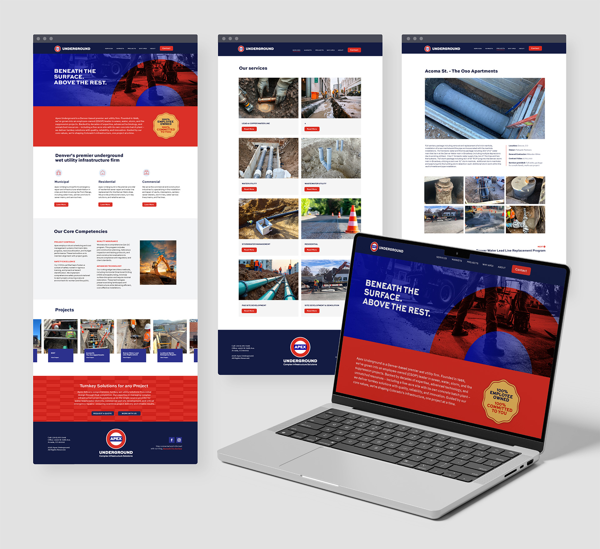
Web Development
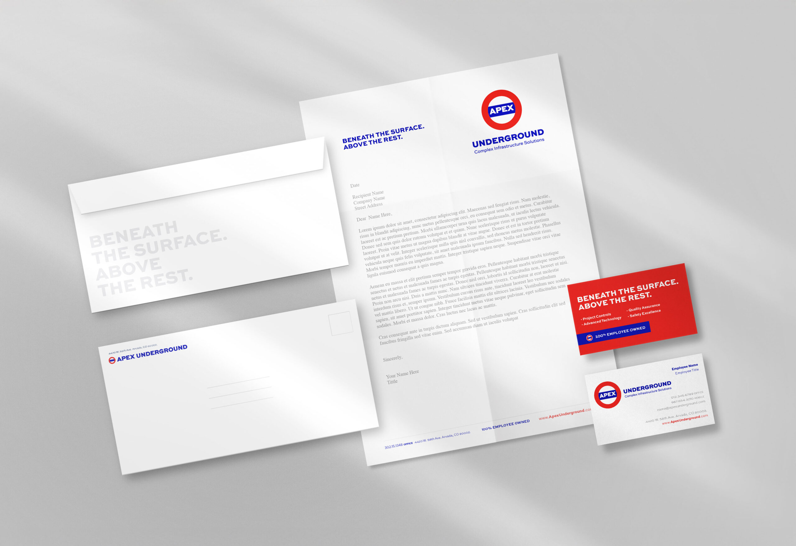
The RESULT
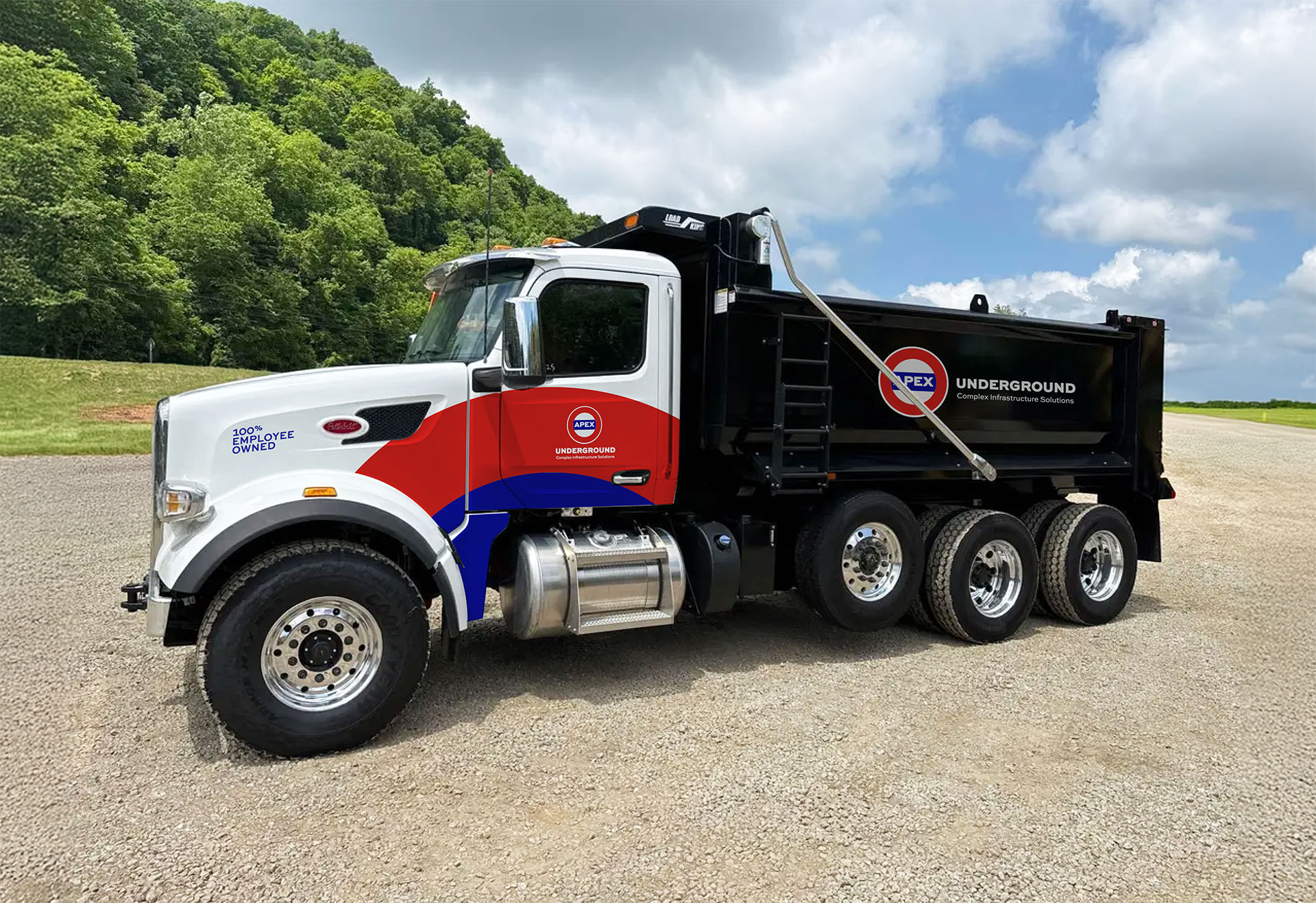
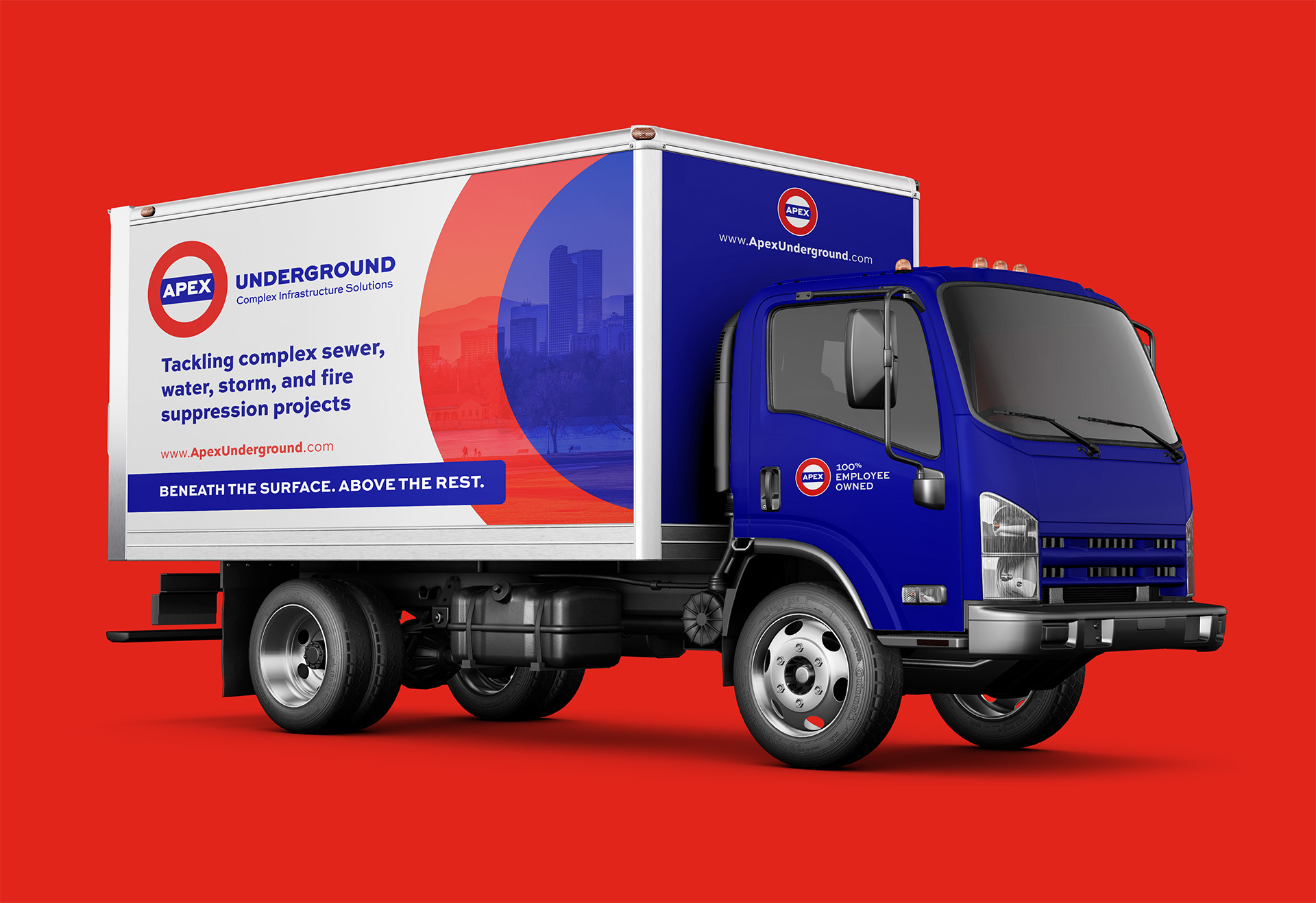
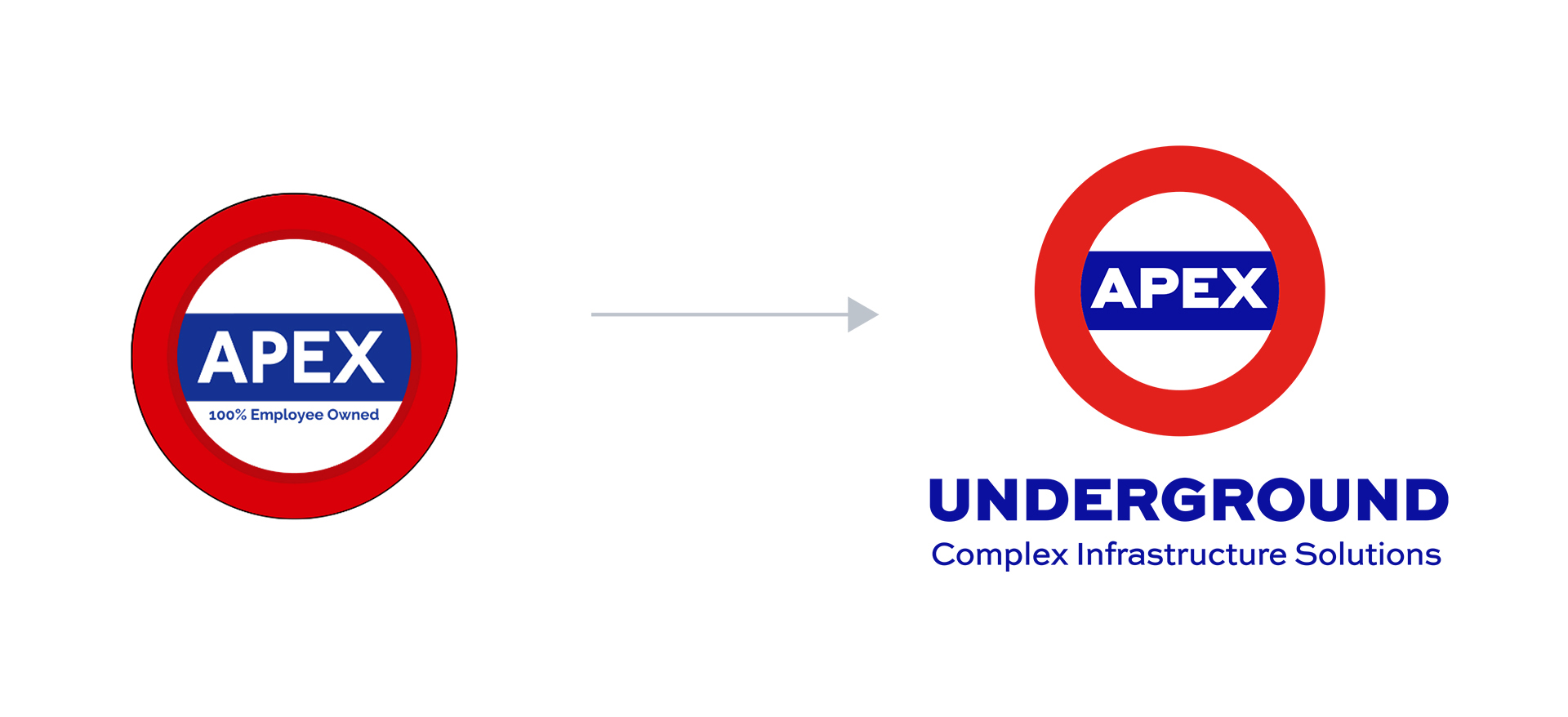
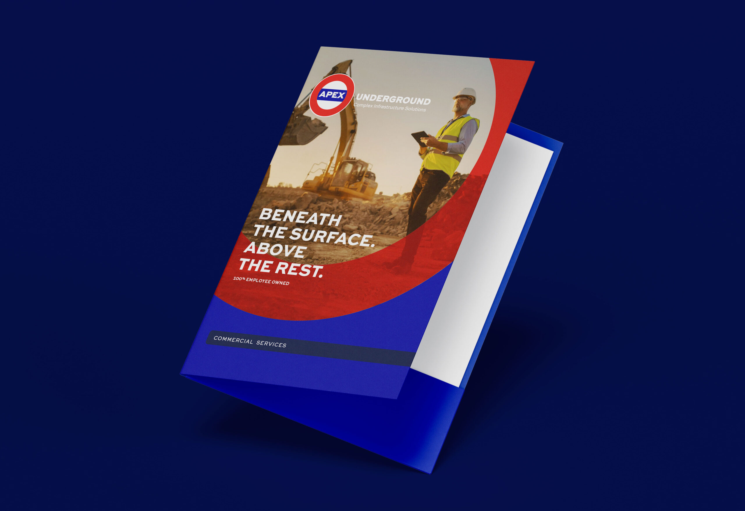
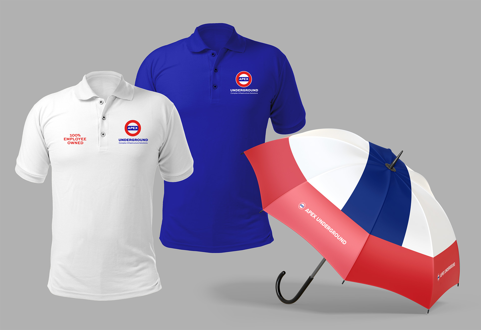
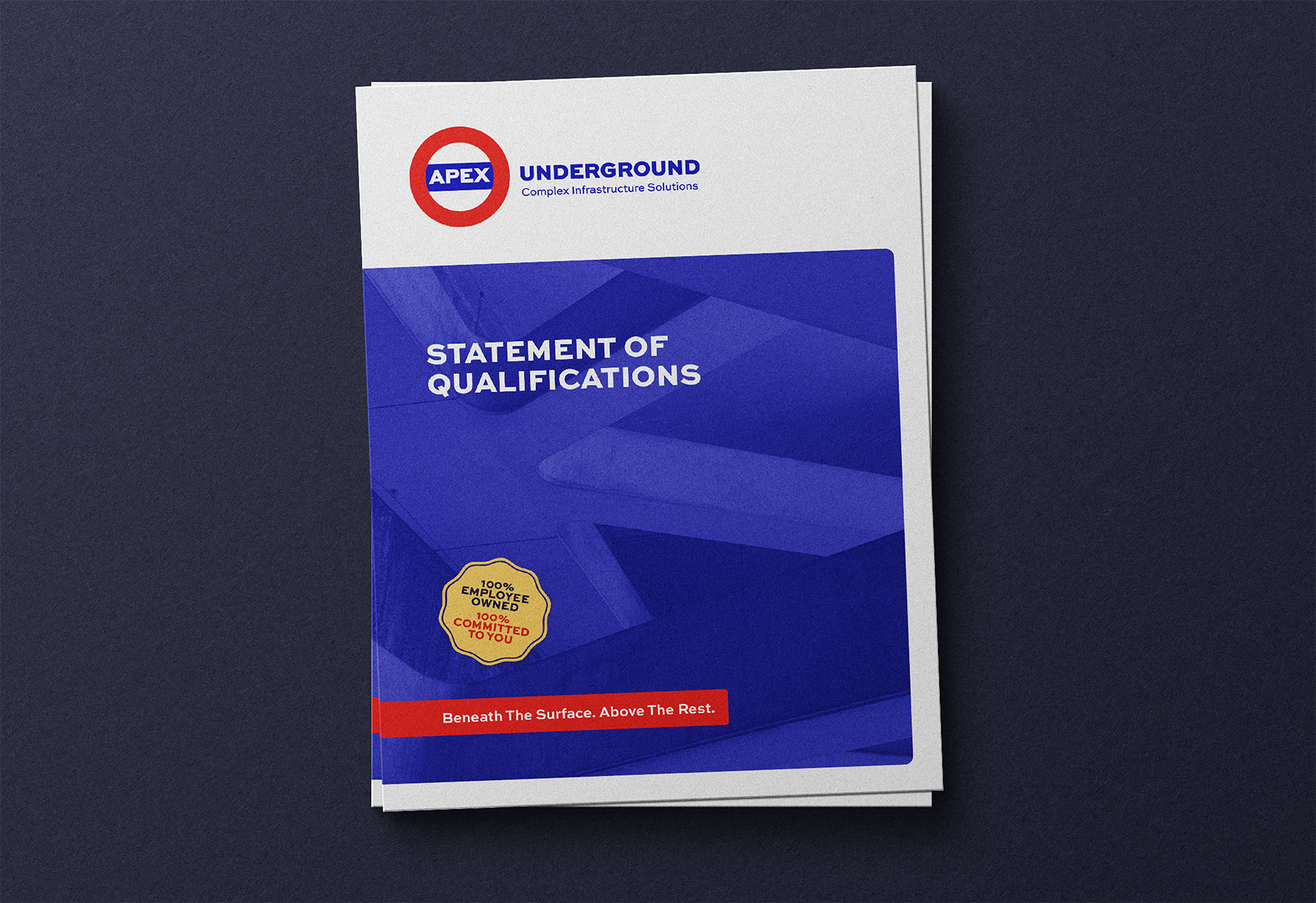
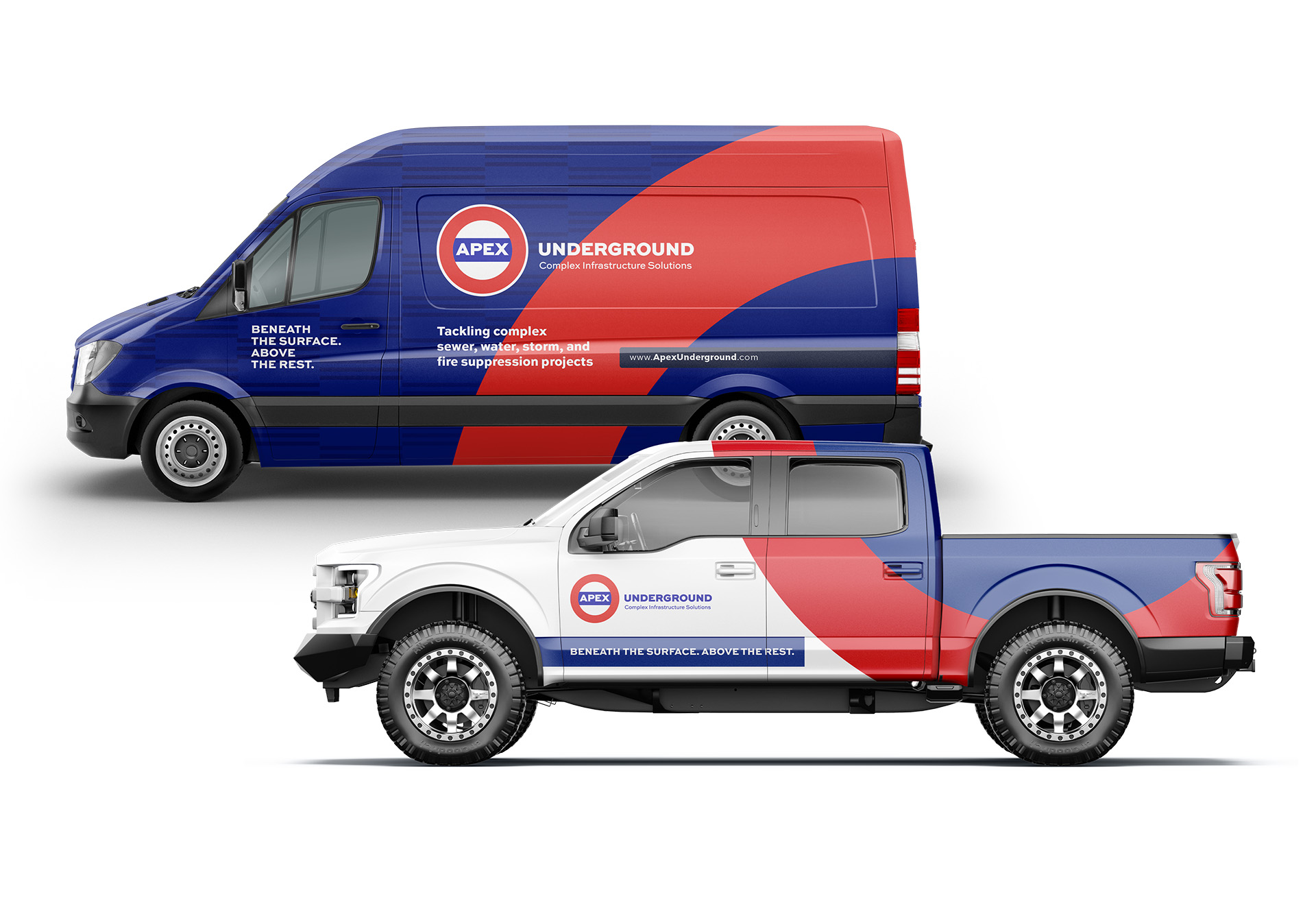
The rebrand united Apex under a single banner as Apex Underground, strengthening recognition and eliminating confusion. The refreshed logo preserved equity, while new typography and a supporting descriptor brought clarity and confidence to the identity. The tagline gave the name deeper meaning, turning a potential contradiction into a compelling differentiator. A modern website and design system provided Apex with a cohesive platform to share its story.
Together, these changes created a stronger, clearer voice—one that honors Apex’s legacy while positioning the company with pride and confidence for the future.
