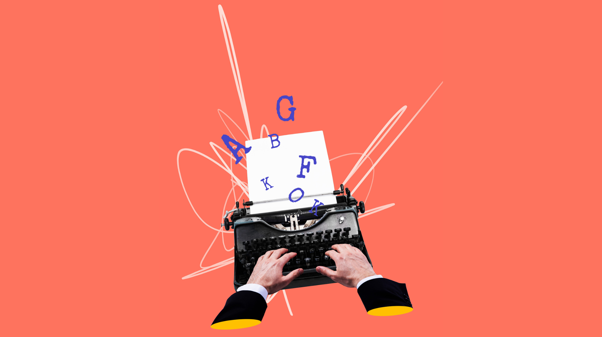
Font Styles and Weights Can Tell an Important Story
Have you ever gotten an email from a boss or significant other written in ALL CAPS? You think to yourself, are they screaming at me or was Caps Lock on? Working with specified font families is an important aspect of branding and establishing a consistent look and feel.
Special attention and thought should be applied when choosing the right fonts for your organization. The same holds true when picking font weights and styles. Type can shout or whisper, be heavy or light, show motion, and even lead a reader through space.
Type should always be readable and flow in a logical manner, usually left to right, top to bottom. Styles and weights should be used to highlight words or phrases and promote a sense of hierarchy. Nothing is more frustrating to a reader than not being able to read text that is presented to them.
You can be creative with fonts while promoting your brand AND while maintaining readability. Consider your audience, stay true to your message and approved font styles, and remember what you are trying to say…then project your tone through font style and weight. Don’t mix too much. Keep it simple and clean, and the reader will thank you for it.


